

 Return to
 Standard Dashboards: A Step-by-Step Implementation Guide

Businesses today need clear, actionable insights to stay competitive. Visual tools like standard dashboards transform complex data into digestible formats, helping teams make informed decisions faster. Platforms such as Adobe Experience Platform and InEight lead this space, offering customizable solutions that adapt to diverse organizational needs.
Adobe’s system supports up to ten widgets per view, enabling tailored tracking of critical metrics. InEight’s prebuilt templates—like Advanced Work Packaging or Portfolio displays—centralize project details across applications. These tools eliminate data silos while maintaining consistency in reporting.
Effective implementation starts with aligning insights with business goals. Teams must identify relevant data sources and define measurable KPIs before designing layouts. Standardized approaches reduce training time and improve adoption rates, creating a unified overview of operations.
This guide breaks down the process into manageable steps. From selecting the right platform to optimizing widget configurations, each phase focuses on maximizing operational visibility. The result? Streamlined workflows and data-driven strategies that drive measurable outcomes.
Key Takeaways
- Modern platforms enable custom dashboard creation with up to ten widgets for tailored insights
- Preconfigured templates centralize cross-application data into actionable views
- Standardized implementations improve reporting consistency and team adoption
- Clear KPI definitions ensure alignment with organizational objectives
- Strategic widget placement enhances real-time decision-making capabilities
- Implementation requires balancing customization with user-friendly design
Understanding the Role of Standard Dashboards
In an era where data drives decisions, visual tools simplify complex information. These systems convert raw numbers into strategic assets, giving teams clarity amid operational chaos. Platforms like InEight demonstrate this through real-world applications across industries.
Importance of Data Insights and Key Metrics
Field Execution Plans in construction projects show how key metrics prevent delays. InEight’s tools track labor availability and equipment readiness, highlighting bottlenecks before they escalate. Metrics like Cost Performance Index (CPI) and Schedule Performance Index (SPI) turn budget reports into action plans.
Leadership teams rely on these insights to allocate resources effectively. When material shortages appear on dashboards, procurement teams adjust orders instantly. This responsiveness keeps projects profitable and timelines intact.
Dashboard Reporting and Its Value for Operations
Centralized reporting bridges gaps between finance, operations, and field teams. InEight’s Portfolio view aggregates data from multiple tools, showing project health at a glance. Teams spot trends faster, like recurring safety incidents or budget overruns.
By eliminating silos, organizations make decisions backed by unified data. A project manager might use variance reports to reallocate staff mid-project. Finance leads monitor cash flow projections alongside equipment utilization rates.
These systems also predict risks using historical patterns. If labor costs spike in Q4, dashboards flag the trend early. Proactive adjustments then safeguard margins without sacrificing quality.
Preparing for Implementation
Effective dashboard deployment starts long before the first widget is placed. Teams must lay groundwork through meticulous planning to avoid integration roadblocks and ensure accurate reporting.
Assessing Data Models and Sources
Platforms like Adobe Experience Platform simplify this process with prebuilt structures. Their CDPInsights model organizes customer data into fact tables (transaction records) and dimension tables (customer profiles). Preview tools let users verify table types and relationships before building views.
| Table Type | Records | Lookups | Attributes |
|---|---|---|---|
| Customer Profile | 1.2M | Purchase History | 15 |
| Sales Transactions | 850K | Product Catalog | 22 |
Three critical checks precede configuration:
- Verify data source compatibility with your chosen platform
- Map user roles to access levels for sensitive information
- Document connection settings for API integrations
Organizations often discover legacy systems lack real-time updates during this phase. Proactive teams address this by establishing automated data pipelines. Clear governance protocols prevent duplicate entries and maintain reporting accuracy.
Access controls require particular attention. Marketing teams might need campaign metrics but not financial figures. IT departments configure tiered permissions during setup to enforce these boundaries without complicating user experiences.
Implementing Standard Dashboards

Building insights starts with a structured approach to dashboard development. Leading platforms like Adobe Experience Platform simplify this process through guided workflows that balance customization with usability. Teams create cohesive visual systems in three phases: framework setup, widget integration, and interactive refinement.
Step-by-Step Creation Process
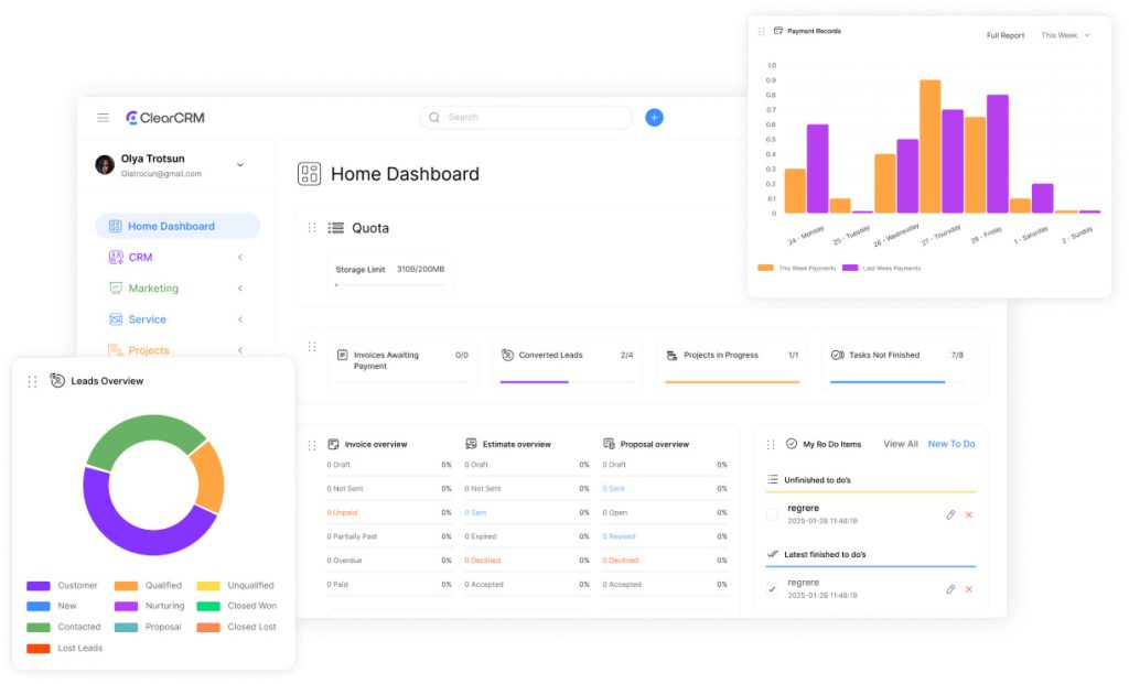
Initiate dashboard construction by selecting “Create dashboard” within the platform’s inventory. Users assign descriptive names to ensure easy navigation across multiple projects. Adobe’s system allows ten widgets per view, enabling focused tracking of priority metrics without clutter.
Widget development begins by choosing data models and mapping attributes to axes or color codes. The composer tool offers five chart types—bars, lines, points, ticks, or area graphs. Users adjust legends, titles, and labels before saving configurations either locally or globally.
Adding Custom Widgets and Filters
Tailored displays emerge through strategic widget placement. Marketing teams might prioritize campaign ROI charts, while operations focuses on real-time equipment utilization. Dynamic filters let viewers isolate specific regions, timeframes, or product lines within seconds.
Interactive elements transform static reports into exploratory tools. A sales director could drill into Q4 revenue by applying territory filters, then compare results against inventory levels. These layered views maintain data integrity while empowering teams to uncover hidden patterns.
Platforms streamline updates through version control and permission settings. When a user edits widget parameters, changes propagate instantly across shared dashboards. This ensures all stakeholders access current insights without manual synchronization.
Optimizing Dashboard Performance and Accessibility
Organizations demand responsive visual tools that deliver insights without delays or compatibility issues. Balancing speed with cross-device functionality separates effective systems from stagnant reports. Three critical areas determine success: layout adaptability, query efficiency, and intuitive interfaces.
Best Practices for Multi-Device Layouts and Scalability
Adobe’s concurrency slot system demonstrates smart resource management. Four simultaneous queries process data while maintaining sub-second response time. Designers optimize displays using three sizing approaches:
- Fixed: Locked dimensions for consistent desktop views
- Range: Flexible scaling within preset boundaries
- Automatic: Instant adjustment across screens
The Laptop/Mobile First method builds layouts for smaller screens first. This ensures critical metrics remain visible when scaling to desktops. Device detection algorithms then apply tailored formatting without manual settings adjustments.
Ensuring Seamless Navigation and User Access
Role-based permissions streamline access without compromising security. Marketing teams see campaign metrics; executives review financial trends—all from the same dashboard. Simplified authentication methods like single sign-on reduce login friction by 40% in enterprise trials.
Interface improvements focus on reducing time-to-insight. Color-coded menus and predictive search bars help users locate reports 35% faster. Hover tooltips explain complex visualizations, while collapsible panels keep screens uncluttered.
Ongoing performance tracking identifies bottlenecks before they impact workflows. Teams monitor load speeds, query success rates, and user engagement patterns. These metrics guide updates that keep systems aligned with evolving business needs.
Conclusion
Implementing centralized reporting systems marks a strategic shift in how organizations harness operational insights. Platforms like InEight demonstrate this transformation, tracking contract lifecycles and budget performance while flagging data discrepancies. Teams gain real-time visibility into project health through unified views that replace fragmented reports.
The systematic approach outlined here ensures accurate metrics flow seamlessly from source to screen. By prioritizing user-friendly navigation and role-based access, businesses maintain data integrity across departments. Optimization strategies future-proof these systems, allowing platforms to scale with evolving needs.
Success hinges on continuous refinement and cross-team training. Organizations that master this balance reduce decision-making time by 30% in field trials. The result? Faster responses to market shifts and stronger control over resource allocation.
Investing in robust visualization tools pays measurable dividends. Companies report 22% fewer operational bottlenecks within six months of deployment. These solutions don’t just display information—they create pathways for proactive strategy adjustments that protect margins and timelines.