

 Return to
 Customizable Dashboards: A Step-by-Step Guide for Professionals

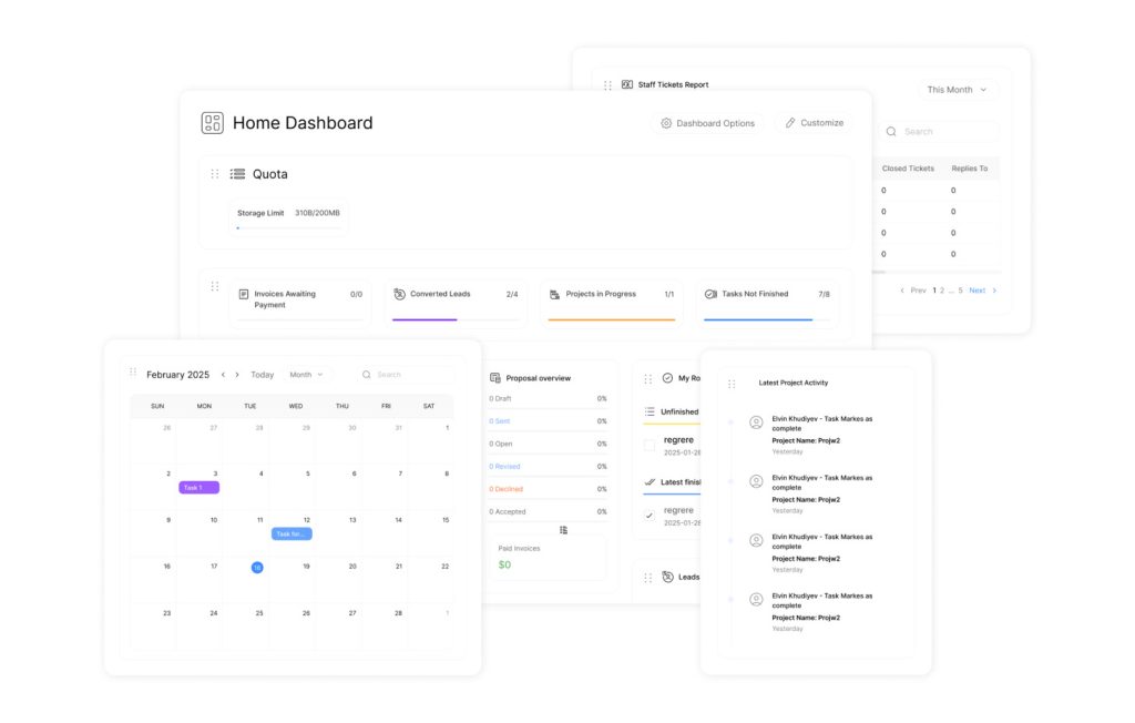
Modern professionals need instant access to critical insights. A well-designed dashboard transforms raw data into clear, actionable information, eliminating hours spent combing through spreadsheets. These tools prioritize efficiency, offering read-only displays that highlight trends, risks, and opportunities at a glance.
Advanced systems like Slate enable dynamic customization. Color-coded alerts automatically flag priority items, while liquid markup allows tailored visual hierarchies. This ensures teams quickly identify severity levels or workflow bottlenecks without manual analysis.
Integration is seamless. Dashboards appear in record tabs, inbox messages, and batch processes, ensuring data remains accessible across touchpoints. Role-based permissions keep sensitive information secure, balancing collaboration with compliance.
Effective implementation starts with strategic focus. By prioritizing metrics that drive decisions, professionals avoid clutter and maintain clarity. The result? A centralized system that empowers teams to act faster—and smarter.
Key Takeaways
- Dashboards convert complex data into visual, instantly digestible insights.
- Automated alerts and color-coding highlight urgent priorities without manual effort.
- Integration across platforms ensures consistent access to critical information.
- Role-based permissions maintain security while enabling teamwork.
- Streamlined designs reduce clutter, focusing on metrics that impact outcomes.
Introduction to Customizable Dashboards and Their Benefits
Business leaders require tools that adapt as quickly as their priorities shift. Dynamic visualization platforms bridge the gap between raw numbers and strategic action, transforming scattered metrics into coherent narratives.
What Are Customizable Dashboards?
These adaptive tools consolidate data streams from CRM systems, financial software, and operational databases. Unlike static reports, they refresh automatically—highlighting sales trends, inventory gaps, or campaign performance without manual input. One marketing director notes: “Real-time updates cut our meeting prep time by half while improving decision accuracy.”
Key Benefits for Business Workflows
Teams gain precision through tailored layouts that surface mission-critical information. Role-specific views ensure sales reps see pipeline analytics while executives monitor revenue forecasts. Subscription tiers prevent overload, limiting reports per dashboard to maintain performance—critical when handling complex datasets.
In practice, integration with existing tools erases silos, letting users pull live figures from spreadsheets or project management apps. To safeguard sensitive data, security protocols automatically restrict access to financials or client details. As a result, this balance of flexibility and control makes these systems indispensable for scaling enterprises.
“The right visualization tool doesn’t just display numbers—it tells your team where to sprint next.”
Planning Your Dashboard Setup
Strategic alignment between data and business goals determines dashboard success. Professionals must balance comprehensive reporting with visual simplicity—too many metrics create noise, while too few leave gaps in decision-making contexts.
Identifying Critical Data Points and Metrics
As a first step, start by mapping operational pain points to measurable outcomes. Depending on the department, a customer service team might prioritize response times and ticket resolution rates, while finance teams track cash flow variances. To illustrate the impact, one healthcare administrator shared: “Our emergency room dashboard shows bed availability and triage wait times—the two metrics that dictate daily staffing decisions.”
Use this three-step framework to filter priorities:
| Data Type | Key Questions | Decision Impact |
|---|---|---|
| Operational | What bottlenecks slow workflows? | Resource allocation |
| Financial | Which expenses exceed projections? | Budget adjustments |
| Customer | Where do satisfaction scores drop? | Process improvements |
Through collaboration, cross-departmental workshops reveal hidden data points that influence multiple teams. In many cases, sales and marketing might jointly prioritize lead conversion rates over raw website traffic numbers. By taking this approach, this collaborative method ensures dashboards serve broader organizational needs rather than isolated functions.
Limit initial displays to 5-7 metrics. For example, an executive dashboard could show:
- Monthly recurring revenue
- Customer churn rate
- Operational uptime percentage
“A dashboard’s value lies not in how much it shows, but how quickly it directs attention to what matters.”
Building Customizable Dashboards: Step-by-Step Process

At the foundation, building an effective dashboard begins with accessing core system features.
From a functionality standpoint, platform navigation determines how quickly teams transform raw metrics into decision-ready insights. To maximize results, follow this structured approach to ensure clarity and technical precision.
Navigating the Dashboard Creation Interface
Start by selecting Database from the main menu. Under Records and Datasets, choose the Dashboards option. Click Create New to initiate the workflow. A configuration window appears where users:
- Assign a clear name (e.g., “Sales Pipeline Tracker”)
- Select display locations like record views or batch processes
- Choose a data base that aligns with reporting needs
| Configuration Setting | Purpose | Example |
|---|---|---|
| Name Field | Identifies dashboard in searches | “Q3 Marketing Metrics” |
| Type Selection | Determines accessibility points | Inbox vs. Record View |
| Base Assignment | Defines underlying dataset | CRM Contacts Database |
Setting Up Data Sources and Exports
Once configured, switch to the Edit Query tab after saving initial settings. To maintain consistency, select data exports from connected systems, ensuring each field uses lowercase naming without spaces. Consequently, this standardization prevents errors during API calls or automated reporting.
Applying Custom CSS and Styling for User-Friendly Layouts
To begin with, the Edit Dashboard tab enables drag-and-drop element arrangement. For greater customization, insert CSS code with flexbox properties. As an example, a sales team might style tables to highlight high-priority leads in red, while HR could adjust grid layouts for mobile recruitment tracking.
“Proper styling isn’t about aesthetics—it’s about reducing cognitive load during rapid analysis.”
Editing and Customizing Your Dashboard for Optimal Display
In today’s dynamic environment, precision in data analysis demands tools that adapt to evolving priorities. To ensure clarity, refining dashboard displays ensures teams see exactly what drives decisions—no distractions, no delays. Ultimately, professionals gain control through granular editing features that sharpen focus and accelerate workflows.
Modifying Queries and Data Filters
Notably, filters transform generic reports into targeted insights. By comparison, adjust date ranges to compare quarterly sales trends or isolate current-week performance. To gain deeper insight, narrow results by team ownership to evaluate individual contributor impact. For broader visibility, apply pipeline-specific filters across all reports simultaneously.
- Click the filter icon on any report to set date parameters or ownership criteria
- Use universal filters for cross-report consistency in batch analyses
- Save filter presets for recurring reviews to eliminate setup repetition
One operations manager notes: “Filtering by region helped us spot inventory gaps three days faster than manual spreadsheet checks.”
Adjusting Layouts and Formatting Options
To illustrate, drag-and-drop editors let users prioritize high-value metrics visually. With that in mind, resize components by clicking the sizing handle in any report’s corner—expand revenue charts while minimizing secondary graphs. From a usability perspective, reposition elements to align with team scanning patterns, placing urgent alerts at top-left for quick detection.
Formatting tools maintain brand consistency:
- Apply company color schemes to charts and headers
- Adjust font sizes for better mobile readability
- Set conditional formatting rules to auto-highlight outliers
“A well-formatted dashboard acts like a compass—it doesn’t just show data, it points teams toward action.”
Responsive designs automatically adjust column counts across devices, ensuring field teams access critical data without horizontal scrolling. These edits turn static displays into dynamic decision engines.
Enhancing Reports and Collaborations on Your Dashboard

Collaboration accelerates decision-making when teams access unified insights. Modern platforms simplify report integration and permission management, turning isolated data into shared strategic assets.
Integrating and Managing Reports
Adding reports starts in the platform’s Reporting section. Users select existing analytics or build new ones directly within the interface. For example, HubSpot allows managers to:
- Browse pre-built templates for common metrics like lead conversion rates
- Drag-and-drop custom charts using real-time sales figures
- Clone high-performing reports for regional team adaptations
Advanced filters let teams refine displays by date ranges or campaign types. One logistics coordinator notes: “Cloning our shipping delay report for each warehouse cut analysis time by 65%.”
Sharing, Cloning, and Collaborating with Users
Granular permissions ensure reports reach the right eyes without compromising security. Access levels range from view-only roles to full editing capabilities. Key features include:
- URL sharing for instant stakeholder access
- Email integration to schedule automated updates
- Version control to track collaborative edits
Privacy settings offer three tiers—private ownership, team visibility, or company-wide access. Marketing leads often combine these tools, sending quarterly performance dashboards via email while restricting raw data exports to managers.
“When finance and sales share the same metrics, budget talks shift from arguments to action plans.”
Conclusion
In today’s fast-paced environment, agility in data analysis separates industry leaders from competitors. Custom dashboards serve as essential tools for translating complex metrics into clear directives. Their value lies in structured implementation—starting with precise naming conventions that reflect each display’s purpose and audience.
First of all, selecting reliable data sources ensures accuracy, while drag-and-drop builders let users assemble reports without coding expertise. As a result, this flexibility allows teams to highlight revenue trends or operational bottlenecks in minutes. In the same way, metric customization maintains brand consistency across departments, whether adjusting color schemes for executives or mobile layouts for field staff.
Scalable solutions adapt as organizations grow, supporting diverse user types from analysts to C-suite leaders. Role-based access controls keep sensitive information secure without hindering collaboration. Platforms with transparent pricing models further simplify adoption, making advanced analytics accessible to businesses at every stage.
By prioritizing strategic design over sheer volume, professionals create dashboards that drive action—not confusion. The result? Faster decisions, aligned teams, and measurable improvements in operational efficiency.