

 Return to
 How to Create Effective Customizable Dashboards for Business

Modern businesses thrive on data-driven decisions. To stay competitive, leaders need instant access to critical metrics that reveal operational health. This is where dynamic dashboard solutions become essential, acting as centralized hubs for real-time information.
Well-designed systems aggregate data from multiple sources into clear visual formats. Teams gain visibility into sales trends, resource use, and workflow bottlenecks. This transparency accelerates problem-solving and aligns departments toward shared goals.
Companies using advanced dashboard tools report faster response times to market shifts. Interactive features let users drill into specifics without IT support. Managers track KPIs through live updates, replacing outdated spreadsheets or fragmented reports.
Effective implementation starts by mapping user needs to data sources. Design choices must balance depth with simplicity—overloading screens defeats the purpose. Regular updates ensure metrics stay relevant as business priorities evolve.
When executed strategically, these tools transform raw numbers into actionable strategies. They foster collaboration while cutting time spent on manual analysis. The result? Organizations operate with sharper focus and measurable outcomes.
Key Takeaways
- Centralized data visualization improves operational awareness
- Real-time metrics enable faster, evidence-based decisions
- Interactive designs adapt to evolving business needs
- Successful systems require alignment with user workflows
- Streamlined reporting boosts cross-team productivity
Introduction to Customizable Dashboards and Their Business Impact
Real-time insights have become the backbone of strategic business management. Modern platforms transform scattered metrics into cohesive visual stories, enabling leaders to spot opportunities and risks at a glance. These systems don’t just display numbers—they highlight connections between sales figures, resource allocation, and customer behavior.
Why Visibility Matters
Organizations using dashboard analytics reduce decision lag by 43% compared to manual reporting methods. Centralized data displays eliminate time wasted searching through emails or legacy tools. Teams identify trends faster through color-coded graphs and drill-down features that reveal root causes behind performance gaps.
| Aspect | Traditional Reports | Dashboard Analytics |
|---|---|---|
| Data Access | Delayed, static | Live updates |
| User Interaction | Read-only | Click-to-filter options |
| Collaboration | Email chains | Shared visual workspace |
| Response Time | Days | Minutes |
Driving Action Through Clarity
Interactive tools let managers test scenarios by adjusting variables like pricing or staffing levels. A retail chain, for example, used live inventory dashboards to cut overstock costs by 18% in one quarter. Such platforms turn raw information into targeted strategies, fostering alignment across departments.
Companies prioritizing dashboard implementation often outperform competitors in customer retention and operational agility. The key lies in designing systems that match specific user needs while maintaining simplicity.
Fundamentals of Effective Dashboard Design
Building a high-impact dashboard starts with two non-negotiable pillars: reliable data foundations and intentional design. Systems that excel in both areas turn complex information into clear pathways for decision-making.
Understanding Your Data Sources
Every dashboard’s value depends on the quality of its inputs. Teams should audit existing databases, APIs, and third-party tools before integration. Financial metrics might pull from accounting software, while customer behavior data could originate from CRM platforms like ClearCRM.
| Source Type | Integration Complexity | Business Impact |
|---|---|---|
| Internal Databases | Low | Core operational insights |
| Cloud Services | Medium | Real-time collaboration |
| Legacy Systems | High | Historical trend analysis |
Data governance protocols prevent inconsistencies. Establish update frequencies and accuracy checks early. This ensures metrics remain trustworthy as teams scale.
User-Centric Design Considerations
Effective displays adapt to different roles. Executives need glanceable summaries, while analysts require drill-down capabilities. Color contrast ratios above 4.5:1 improve readability, while progressive disclosure menus reduce clutter.
Prioritize these elements:
- Mobile-responsive layouts for field teams
- Drag-and-drop filters for quick adjustments
- Standardized labels across all modules
Testing prototypes with actual users reveals navigation pain points. Teams achieve 27% faster adoption rates when designs mirror existing workflows. The goal? Create systems people want to use daily.
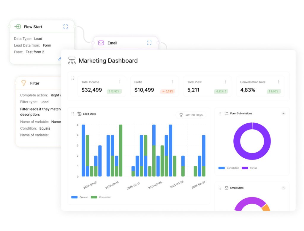
Step-by-Step Guide to Creating a New Dashboard

Implementing a functional dashboard requires methodical planning and precise configuration. This process transforms raw data streams into organized visual tools that drive daily operations.
Navigating the Dashboard Creation Process
Start by accessing your platform’s administrative panel. In systems like Slate, users typically select Database from the main menu, then choose Dashboards under records management. The New Dashboard button initiates the setup phase.
First, assign a clear name reflecting the dashboard’s purpose, like “Sales Pipeline Tracker.” Ambiguous titles cause confusion during team collaborations. Next, specify the type and location – options might include customer service portals or inventory management interfaces.
Configuring Essential Settings and Features
Database selection determines which datasets populate your views. Choose a base aligned with your primary data source, whether CRM entries or financial records. This step ensures relevant metrics appear automatically.
Adjust settings like refresh rates to balance real-time accuracy with system performance. Set user permissions to protect sensitive data while enabling cross-department access. Always click save after testing configurations to lock changes.
Successful deployments hinge on two factors: intuitive design for end-users and backend alignment with security protocols. Regular audits ensure dashboards adapt as business needs shift.
Designing Queries and Enhancing Data Visualization
Transforming raw information into actionable visuals requires precise query design and intentional styling. Teams that master these skills create dashboard experiences where metrics tell compelling stories. The process blends technical accuracy with visual clarity.
Crafting Effective Data Queries
Start by navigating to the Edit Query interface in your dashboard tool. Administrators select specific data exports—sales figures or inventory levels—to populate visual elements. Use lowercase names without spaces for exports, like “monthly_revenue,” to ensure system compatibility.
| Approach | Speed | Flexibility | Maintenance |
|---|---|---|---|
| Basic Queries | Fast setup | Limited filters | High |
| Optimized Queries | 2x faster load | Dynamic variables | Low |
Well-structured queries minimize loading times while maximizing relevance. Focus on fields that directly impact decision-making, like customer retention rates or production costs. Test outputs before finalizing.
Applying CSS and Styling Techniques
Switch to the Edit Dashboard tab to arrange elements. Drag exported data blocks from the right panel into your layout. Apply flexbox CSS code to create responsive grids that adapt to screen sizes:
.dash_table {
display: flex;
flex-wrap: wrap;
gap: 12px;
}
Enhance readability with borders and padding. Use contrasting colors for metric labels and values. These techniques ensure consistent displays across devices while reinforcing brand identity.
Teams that combine optimized queries with strategic styling reduce training time by 31%. Clear visuals help users spot trends faster, turning data exploration into decisive action.
Using Dashboard Templates for Rapid Deployment

Accelerating dashboard implementation has become critical for maintaining competitive agility. Pre-built templates offer ready-made solutions that slash development cycles while ensuring polished results. These frameworks combine best practices in data visualization with adaptable structures for diverse business needs.
Leading platforms provide extensive template libraries categorized by industry and function. Sales teams might choose pipeline trackers, while operations managers select resource allocation models. This approach eliminates guesswork in layout design and metric selection.
Benefits of Pre-Designed Templates
Template-based systems cut setup time by up to 65% compared to scratch-built dashboards. They incorporate proven methods for organizing display data, from KPI hierarchies to interactive filters. Financial institutions using pre-configured templates reduced reporting errors by 22% in recent studies.
| Template Type | Setup Time | Common Use Cases |
|---|---|---|
| Operational | 2-4 hours | Inventory tracking, service metrics |
| Analytical | 6-8 hours | Trend analysis, predictive modeling |
| Executive | 1-2 hours | Revenue summaries, growth projections |
Customizing Layouts and Visual Elements
Most templates allow adjustments through intuitive drag-and-drop interfaces. Teams can modify color schemes to match brand guidelines or reposition charts without coding. A healthcare provider recently adapted CRM-integrated templates to track patient outcomes across 23 clinics.
Advanced systems enable CSS overrides for granular styling control. Users might adjust grid layouts or font weights while preserving the template’s core functionality. These tweaks ensure dashboards meet specific operational needs without compromising load speeds.
Regular template updates keep visual elements aligned with evolving data standards. Organizations maintain consistency across departments while allowing localized customization—a balance that drives adoption and utility.
Streamlining Development with Dashboard Mockups
Visual prototypes accelerate dashboard development cycles while minimizing resource risks. By testing concepts before full production, teams validate layouts and functionality efficiently. This approach bridges vision with execution through tangible models.
Advantages of Rapid Prototyping
Mockups slash development time by 40-60% compared to coding from scratch. Tools like Figma and Luzmo transform wireframes into interactive previews within hours. Teams spot design flaws early—like misaligned grid systems or unclear data hierarchies—before engineering begins.
Iterative Feedback and Design Refinement
Stakeholders across departments can click through prototypes, suggesting improvements via real-time comments. A logistics company reduced revision rounds by 58% using Instachart to convert Figma files into live dashboards during testing phases. This collaborative process ensures final products align with user needs.
Modern platforms automate tedious tasks, freeing teams to focus on strategic features. Regular feedback loops create polished tools faster while maintaining budget control. The result? Production-ready dashboards that drive decisions from day one.