

 Return to
 Standard Dashboards: A Guide to Best Practices for Business

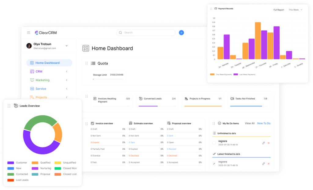
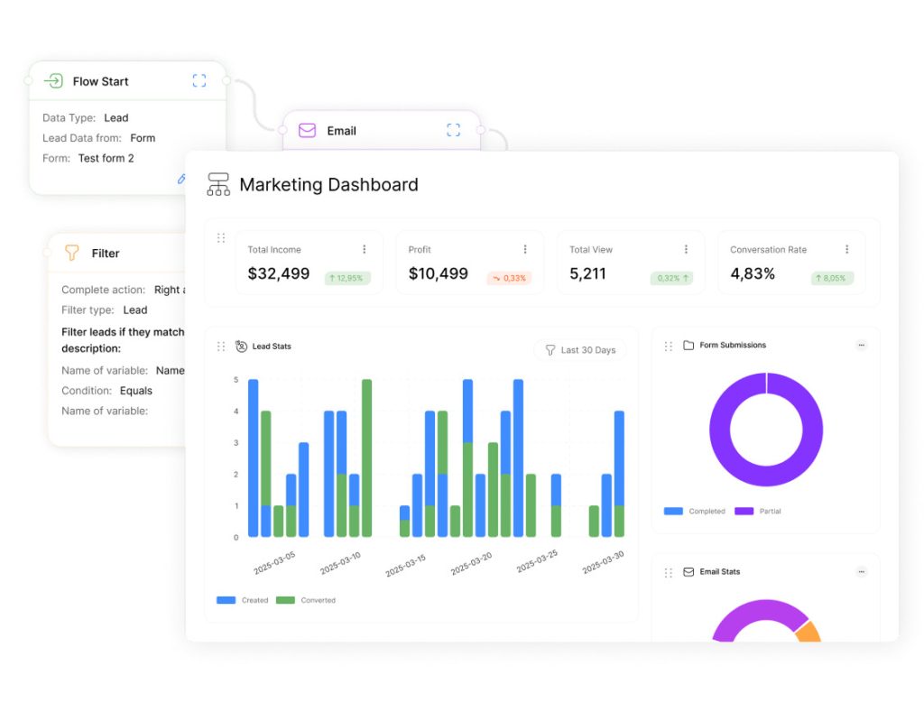
Centralized tools for tracking business metrics are now essential. Organizations rely on systems like ClearCRM to align teams, accelerate decisions, and turn raw numbers into actionable strategies. A well-structured dashboard acts as a command center, combining data clarity with strategic focus to drive measurable results.
These tools simplify complex data into digestible formats, enabling teams to recognize patterns and respond quickly. For example, real-time sales trends or customer behavior analytics enable leaders to adjust tactics before opportunities fade. The best solutions merge performance metrics with clear objectives, ensuring every chart or graph directly supports organizational priorities.
Design plays a pivotal role. An effective layout prioritizes critical insights over decorative visuals, reducing cognitive load while highlighting key trends. Industry leaders like Tableau and Adobe emphasize simplicity: overcrowded interfaces slow decision-making rather than speeding it.
This guide explores how to create dashboards that deliver value at every level. Topics include tailoring designs to specific audiences, balancing interactivity with usability, and optimizing displays for mobile or desktop use. Readers will learn to avoid common pitfalls while maximizing the impact of their data investments.
Key Takeaways
- Dashboards align teams by translating data into shared objectives
- Purpose-driven design ensures metrics directly support business goals
- Clean visual layouts reduce analysis time and improve accuracy
- Real-time updates enable faster responses to emerging trends
- Cross-device compatibility maintains functionality on any screen
Understanding the Purpose and Audience
Effective data tools succeed when creators first answer two questions: what problem does this solve? and who needs these answers? Clarity at this stage prevents wasted effort and ensures every element serves a strategic role.
Defining Dashboard Objectives
Start by outlining measurable goals. A marketing team might need real-time campaign performance details, while executives prioritize quarterly revenue trends. Documenting these requirements helps designers choose relevant visualizations and eliminate distracting data points.
For example, an e-commerce team tracking inventory could use filters to isolate regional stock levels. This precision ensures users see only the information that drives their daily decisions.
Assessing Audience Needs
Technical staff often require granular table data, whereas managers prefer high-level summaries. Conduct interviews or surveys to identify:
- Key metrics each role monitors
- Preferred data formats (charts vs. raw numbers)
- Frequency of updates needed
Position critical insights like sales targets or error rates in the top left of the view – eye-tracking studies show this area gets the most attention. Pair this placement with drill-down options for users needing deeper details.
One healthcare provider redesigned their patient flow dashboard after discovering nurses needed quick bed availability information, while administrators focused on occupancy rates. Custom filters and color-coded visualizations reduced decision time by 40%.
Standard Dashboards: Core Design and Layout Principles
Strong visual tools rely on strategic layout choices that guide users to insights without clutter. Designers must balance data depth with intuitive navigation, starting with device compatibility. A mobile-first approach ensures size adjustments maintain readability on smaller screens before scaling up.
Prioritizing the Top-Left Zone
Eye-tracking studies confirm users focus first on the top-left area. Place critical metrics like revenue trends or error rates here. For example, a logistics team might highlight delivery delays in this zone, allowing quick intervention.
Secondary data belongs in lower sections. Use tables sparingly here—overloading them obscures patterns. Instead, link to detailed reports for users needing deeper analysis.
Simplifying Complex Data Displays
Limit fields to essential metrics. Each added element should solve a specific problem. Financial teams, for instance, might track only cash flow and budget adherence. Group related objects using containers like bordered sections or color blocks.
| Design Element | Purpose | Best Practice |
|---|---|---|
| Size Approach | Ensure cross-device clarity | Start with mobile dimensions |
| Visual Hierarchy | Direct attention | Place key metrics top-left |
| Container Use | Reduce cognitive load | Group 3-5 related objects |
Always test preview modes early in the design process. A retail company reduced user training time by 25% after simulating how sales data appeared on tablets during creation. Iterate based on feedback—simplicity often outperforms complexity.
Optimizing Dashboard Performance and Interactivity
Speed and precision define next-generation data exploration interfaces. Interactive elements turn raw metrics into actionable insights while maintaining system responsiveness. Designers must balance user control with technical efficiency.
Integrating Filters and Highlight Actions
Filters let users isolate critical patterns. A sales team might add region or product type filters to compare performance across markets. Tableau’s highlight mode demonstrates this: clicking a data point automatically emphasizes related metrics across visualizations.
Effective interactivity requires matching chart type to user needs. Bar graphs suit selection-based comparisons, while heatmaps benefit from hover button actions. Always test option placements during worksheet design to avoid clutter.
Ensuring Fast and Responsive Data Displays
Performance hinges on worksheet optimization. Limit complex calculations in live views—precompute values where possible. Use these techniques:
| Element | Optimization | Impact |
|---|---|---|
| Filters | Apply to relevant sheets only | Reduces load time by 15-30% |
| Buttons | Use vector icons | Cuts render time by 20ms per click |
| Charts | Limit data points to 500 per view | Improves scroll smoothness |
A retail chain implemented dynamic filter groups for inventory analysis. Regional managers now toggle between product type and supplier mode in under two seconds—down from eight-second waits in legacy systems.
Adapting Dashboards for Device Variability and Screen Sizes
Modern businesses operate across multiple device types, from smartphones to conference room displays. Ensuring consistent data clarity requires layouts that adapt to varying screen dimensions without sacrificing functionality. Design teams must balance flexibility with precision to maintain user trust.
Comparing Fixed, Automatic, and Range Sizing
Fixed sizing locks elements to exact pixel measurements—ideal for print reports but risky on smaller screens. Automatic scaling adjusts components proportionally, while range sizing sets minimum and maximum boundaries. A retail chain improved mobile views by combining range sizing for charts with automatic text scaling.
| Sizing Type | Best Use Case | Limitations |
|---|---|---|
| Fixed | Desktop-only reports | Cropping issues on mobile |
| Automatic | Mixed-device teams | Overlapping elements |
| Range | Responsive designs | Complex setup |
Customizing Layouts for Tablets and Mobile Devices
Mobile-first designs prioritize vertical scrolling and tap-friendly fields. One logistics firm reworked their shipment tracking views by stacking key metrics and adding swipe gestures. Tablet layouts often benefit from split-screen configurations showing summaries alongside drill-down options.
Strategies for Large-Screen Presentations
Conference room displays demand bold visualizations with minimal text. Use the extra space to showcase real-time KPIs alongside trend comparisons. Interactive buttons let presenters toggle between datasets during discussions.
Pro Tip: QA teams should test device displays under real-world conditions. One healthcare provider reduced user complaints by 60% by simulating tablet use in brightly lit environments.
Conclusion
Businesses thrive when data becomes actionable insight, not just numbers on a screen. The practices outlined here—from defining objectives to optimizing sizing for tablets—create tools that serve both users and customers effectively.
Strategic titles and visual cues guide attention, while adaptive layouts ensure clarity across devices. Companies that prioritize these principles reduce analysis time by up to 40%, according to recent industry studies.
Three critical takeaways:
- Interactive elements must balance depth with simplicity
- Mobile-first designs prevent functional gaps
- Real-time updates transform reactive strategies into proactive ones
Organizations should use these guidelines as a foundation, not a finish line. Continuous testing with actual users reveals opportunities to refine sizing choices or tablet interactions.
For teams ready to advance further, exploring dynamic filtering and predictive analytics unlocks new levels of responsiveness. When executed well, these tools become indispensable allies in achieving business goals—today and over time.