

 Return to
 Maximize Efficiency with Customizable Dashboards Solutions

Customizable Dashboards give teams instant visibility into key metrics. Businesses today grapple with data overload. Information pours in from countless sources, creating chaos instead of clarity. Turning raw numbers into actionable strategies demands tools that adapt to unique needs while simplifying complexity.
Dynamic dashboard platforms solve this problem. They let teams design visual reports aligned with their goals, whether tracking sales trends or monitoring project timelines. By consolidating scattered data streams into one view, companies cut hours spent on manual updates. Decision-makers gain time to focus on growth, not spreadsheets.
These systems thrive on accessibility. Even non-technical users can build interactive charts or share real-time metrics with stakeholders. Instant visibility into performance helps teams spot opportunities faster—like adjusting campaigns before budgets bleed or identifying customer trends ahead of competitors.
Scalability ensures long-term value. As a business expands, its dashboards evolve. A unified platform supports new data sources, departments, or analytics needs without overhauling existing workflows. This flexibility turns information into a strategic asset, not a bottleneck.
Key Takeaways
- Centralized data visualization reduces manual work and accelerates decision-making.
- User-friendly interfaces empower teams to create reports without coding skills.
- Real-time metrics provide immediate insights into operational performance.
- Scalable solutions grow alongside businesses, adapting to changing needs.
- Unified dashboards improve cross-departmental collaboration and transparency.
Introduction to Customizable Dashboards
In an era where data drives decisions, tailored visualization tools are reshaping how companies operate. These systems ClearCRM act as command centers, filtering noise to highlight what matters most. For teams drowning in spreadsheets, they provide clarity through focused, role-specific insights.
What Are Customizable Dashboards?
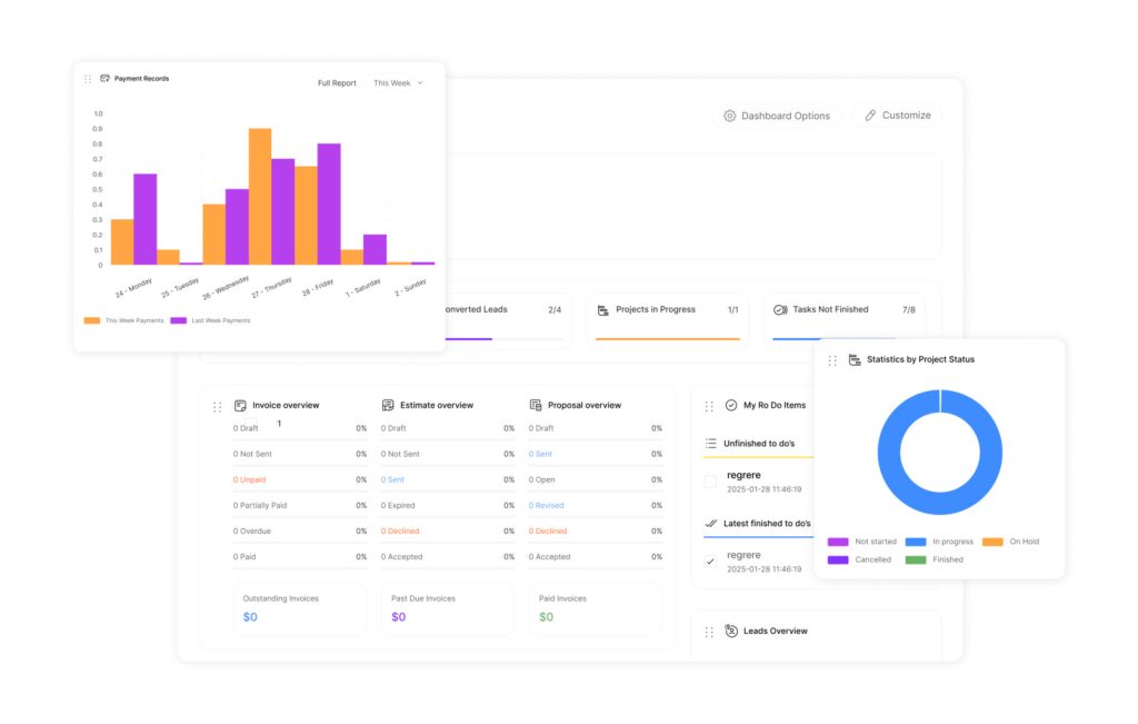
Custom dashboards are intelligent interfaces that display critical metrics in real time. They convert raw numbers into charts, graphs, and tables aligned with specific business goals. Unlike static reports, they let users adjust views to track sales pipelines, marketing ROI, or operational efficiency—all from one screen.
For example, restaurant management teams might monitor table turnover rates alongside inventory levels. Retailers could compare regional sales against staffing costs. The tool adapts to each user’s priorities without requiring technical expertise.
Key Benefits for Businesses
These platforms slash hours spent compiling reports. Teams access live data instead of waiting for weekly summaries. Decision-makers spot trends faster, whether it’s a dip in customer satisfaction or a surge in website traffic.
Interactive features let users drill into details. Click a sales region to see agent performance. Hover over a graph to compare quarterly targets. Real-time updates ensure everyone works with the latest numbers, reducing errors from outdated spreadsheets.
Scalability is another advantage. As companies grow, dashboards add new data sources or user permissions. Departments maintain consistent reporting standards while tailoring views for finance, operations, or HR needs. This balance between structure and flexibility fuels smarter, faster choices across organizations.
Understanding the Needs for Custom Data Sources
Modern organizations juggle information stored in CRMs, spreadsheets, and cloud apps. Without unified access, critical insights remain trapped in disconnected systems. Effective analysis demands tools that bridge these gaps while maintaining accuracy.
Integrating Multiple Data Sources
Businesses often pull metrics from accounting software, marketing platforms, and IoT devices. Connecting these multiple data sources eliminates silos that distort decision-making. A retail chain, for instance, could merge POS data with inventory levels to optimize stock replenishment.
APIs and middleware simplify integration, allowing real-time updates across systems. Teams gain a 360-degree view of operations, spotting patterns like seasonal demand spikes or supply chain bottlenecks. This comprehensive coverage reduces blind spots in strategy development.
Choosing the Right Data Source
Not all data sources deliver equal value. Teams must prioritize those aligning with KPIs—like customer retention rates or production costs. A SaaS company might focus on user engagement metrics from its app analytics platform.
Evaluate factors like update frequency and historical depth. A source with stale data undermines real-time dashboards. Similarly, limited API access can block automation. Rigorous vetting ensures metrics reflect true performance.
Successful implementations map how sources interact. For example, linking CRM data with support tickets reveals how sales promises impact customer satisfaction. This clarity turns raw numbers into actionable intelligence.
Building Custom Dashboards with Drag-and-Drop Features
Streamlined analytics tools are redefining how teams transform raw data into strategic insights. Platforms with intuitive interfaces allow users to build custom dashboards in minutes, not days. This eliminates reliance on IT teams while ensuring decision-makers access precise metrics.
Accelerate Setup with Pre-built Metrics
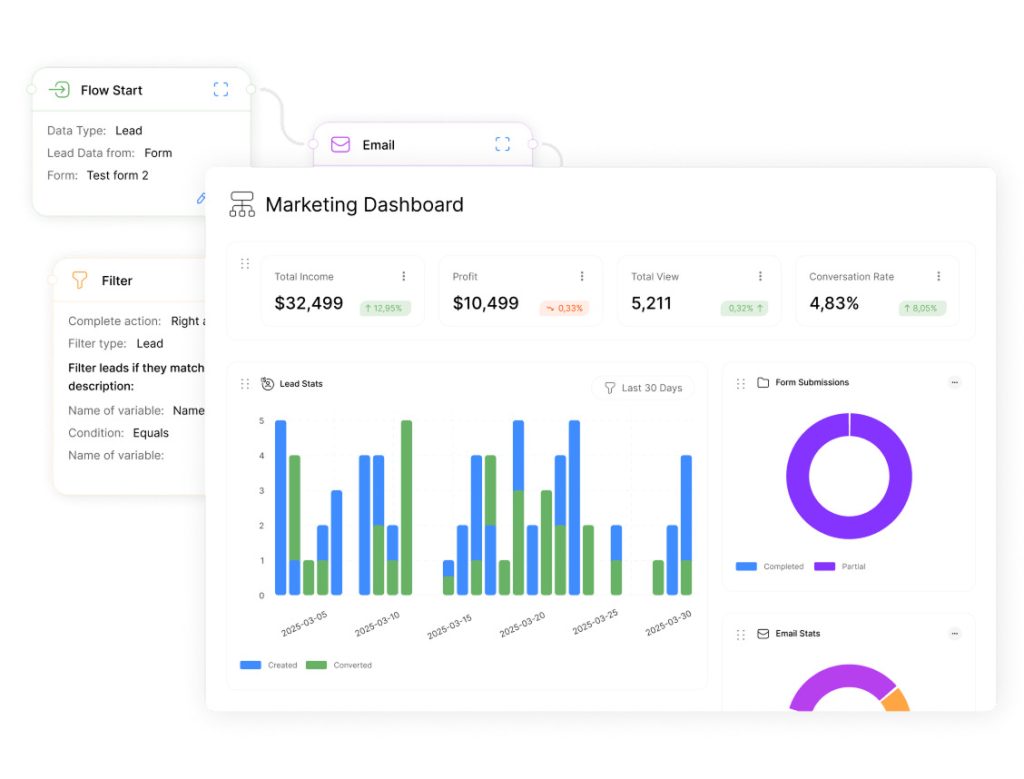
Creating a new dashboard starts with naming it based on its purpose—like “Q3 Sales Performance” or “Marketing Campaign ROI.” Users then connect to relevant data sources, from CRM platforms to accounting software. Integrated libraries offer thousands of pre-built metrics, removing manual calculations for common KPIs.
Drag-and-drop functionality simplifies layout design. Teams select revenue charts, conversion graphs, or inventory tables from the metric library. Position them anywhere on the screen to prioritize high-impact data. Visualizations update automatically, pulling real-time numbers without coding.
Each metric block adapts to specific needs. Change a pie chart to a bar graph with one click. Adjust date ranges or apply filters to compare regional performance. These tweaks ensure every custom dashboard aligns with evolving business questions.
Automated data population slashes setup time. Once metrics are placed, live information flows into chosen formats instantly. This turns complex datasets into actionable views faster than compiling spreadsheets—freeing teams to focus on analysis, not design.
Customizable Dashboards: Tailoring Your Workflow
Companies face diverse operational demands across departments and roles. Tailored analytics interfaces bridge this gap by letting teams mold data displays to their exact needs. This adaptability transforms generic metrics into strategic assets aligned with daily priorities.
Personalizing Your Workflow
Role-specific dashboards eliminate clutter. Sales managers see pipeline forecasts while HR tracks hiring metrics—all from the same platform. Color-coded widgets and adjustable layouts let users highlight what matters most. Time-sensitive alerts appear front-and-center, ensuring urgent issues get immediate attention.
Client-facing teams benefit from customized views too. A marketing agency might create client-specific dashboards showing campaign ROI and content engagement. Real-time updates keep stakeholders informed without manual reporting. “Our teams save 12 hours weekly by letting clients access live project metrics,” notes a operations director at a digital consultancy.
| Role | Key Metrics | Time Saved Weekly |
|---|---|---|
| Sales Lead | Deal velocity, quota attainment | 8 hours |
| Marketing Manager | Lead conversion rates, CAC | 6 hours |
| Customer Support | Ticket resolution time, CSAT | 5 hours |
Pre-built templates maintain consistency while allowing adjustments. Finance teams can standardize revenue reports but add regional expense breakdowns. This balance between structure and flexibility reduces onboarding time for new hires.
Streamlined workflows cut search time for critical data. Teams act faster on inventory shortages or service bottlenecks. When every second counts, personalized dashboards turn chaos into clarity.
Enhancing Data Visualization and Metric Customization
Effective data analysis hinges on two critical choices: what to measure and how to display it. Combining precise metrics with intuitive visuals turns raw numbers into strategic guidance. Teams gain clarity when every chart aligns with their decision-making priorities.
Selecting Metrics and Visualization Types
Start by choosing metrics tied to core goals. Sales teams might track All Deals Amount, while marketers monitor Opened Email by Subject rates. Prioritize indicators that reveal progress toward KPIs—like customer retention or production costs.
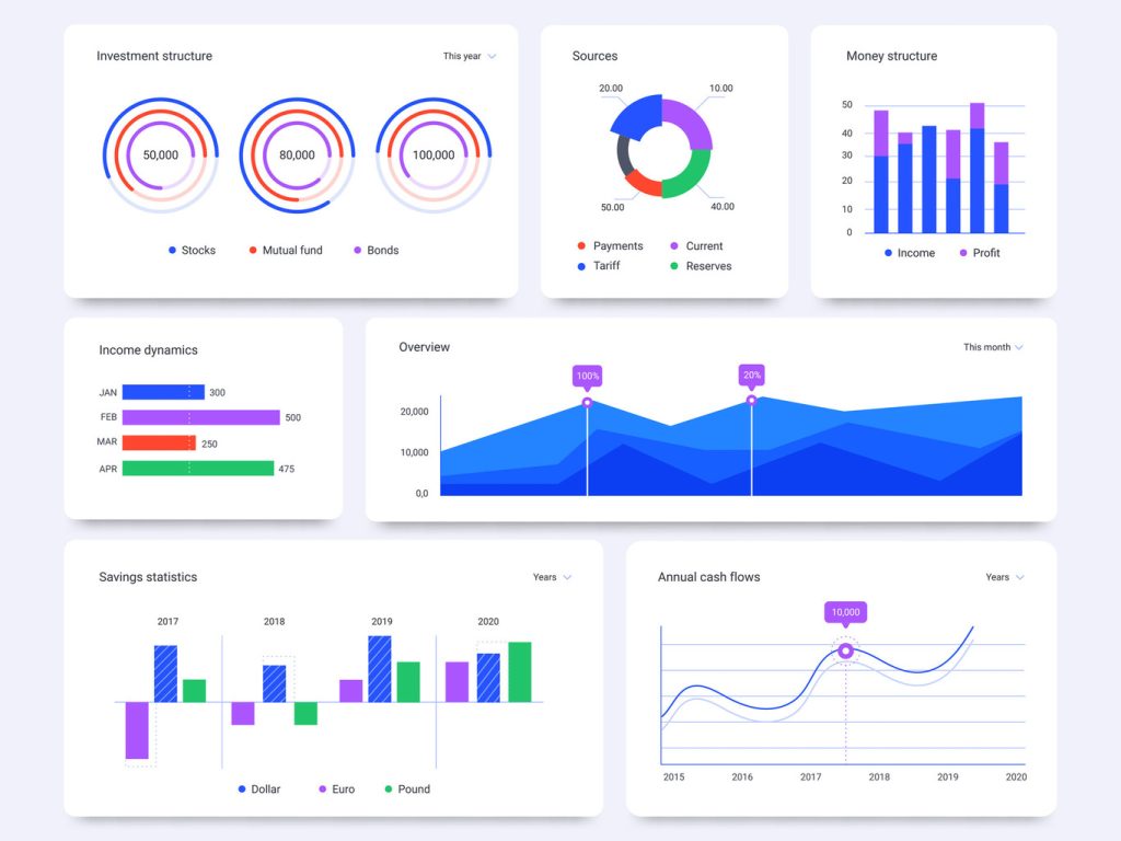
Match visualization types to the data story. Use line charts for revenue trends over time. Compare regional performance with bar graphs. Pie charts work for budget allocation breakdowns. “The right chart cuts analysis time by 40%,” notes a retail analytics director.
- Trend identification: Line charts
- Category comparisons: Horizontal bars
- Proportions: Stacked area charts
Creating Custom Calculations
Pre-built metrics don’t always capture unique needs. Build formulas for Average Order Value or Lifetime Value (Monthly) to uncover hidden patterns. For example:
- Combine sales data with customer demographics
- Calculate inventory turnover rates
- Track support ticket resolution speeds
These tailored metrics help teams spot bottlenecks—like low-performing email subject lines or rising open ticket counts. Dynamic tools update calculations automatically, ensuring real-time accuracy.
Adjust visualization styles as objectives shift. A marketing dashboard might swap funnel charts for heatmaps during campaign audits. This flexibility keeps insights relevant amid changing markets.
Seamless Integration with Pre-built Metrics Libraries
Modern analytics platforms eliminate manual setup through ready-to-use measurement collections. These libraries house thousands of business-specific indicators, allowing teams to skip formula creation and focus on insights. One-click integration connects directly to tools like Salesforce or QuickBooks, pulling live numbers without coding.
Quick Data Population
Selecting metrics from the source library triggers instant visualization. Drag “Monthly Recurring Revenue” into a dashboard, and it auto-populates as a bar chart or table. Marketing teams might add “Email Open Rates” beside “Lead Conversion Costs” to assess campaign efficiency.
Real-time synchronization ensures metrics update across all views. Inventory levels adjust as warehouse scanners log shipments. Support ticket volumes refresh when customers submit requests. This automation reduces errors from stale spreadsheets.
- Sales pipelines sync with CRM deal stages
- Financial dashboards reflect accounting software balances
- Customer service interfaces display live chat response times
Platforms like Databox offer over 1,200 pre-configured metrics. “We built three department-specific interfaces in one morning,” reports a tech startup COO. Teams bypass IT requests while maintaining data accuracy.
Regular library expansions add industry-specific measurements. Healthcare providers track patient wait times. E-commerce managers monitor cart abandonment rates. This adaptability keeps businesses aligned with evolving benchmarks.
By cutting setup time from days to minutes, these solutions let organizations act on trends faster. Real-time revenue graphs or inventory alerts become decision-making fuel, not delayed reports.
Simplifying Data Analysis with Customizable Dashboards
Customizable Dashboards make data comparison fast and intuitive. Data complexity no longer needs to paralyze decision-making. Modern dashboard tools convert overwhelming datasets into clear visual stories. Teams quickly spot trends, like seasonal sales dips or sudden inventory shortages, through color-coded charts and dynamic graphs. Customizable Dashboards improve decision-making with clearer insights.
Unified views eliminate manual data stitching. Instead of jumping between spreadsheets and apps, users see all metrics on one screen. Marketing teams, for instance, can track campaign costs alongside lead generation rates in real time. This consolidation reduces errors and speeds up reporting cycles.
Interactive features let users dive deeper. Click a revenue bar to view regional breakdowns. Filter timelines to compare quarterly performance. Drag-and-drop filters adjust metrics on the fly, turning static numbers into actionable insights.
| Department | Key Metrics Tracked | Time Saved Weekly |
|---|---|---|
| Sales | Deal closure rates, pipeline health | 7 hours |
| Operations | Inventory turnover, shipping delays | 9 hours |
| Marketing | ROI per channel, conversion costs | 6 hours |
Customizable Dashboards help teams track performance trends in real time. Real-time updates keep strategies agile. A sudden drop in website traffic triggers instant alerts. Managers reroute resources before losses mount. This immediacy turns analysis into action, not hindsight. Customizable Dashboards highlight the most important KPIs.
Visual simplicity bridges skill gaps. Executives grasp financial forecasts through heatmaps. Support teams monitor ticket volumes via progress bars. Every stakeholder engages with data at their comfort level.
Role-specific views prevent information overload. Finance focuses on cash flow charts while HR tracks hiring metrics. Teams align dashboards with daily priorities, ensuring faster responses to critical shifts.
Optimizing Business Growth with Efficient Dashboard Templates

Standardized frameworks accelerate growth while maintaining data integrity. Dashboard templates offer pre-designed layouts that balance speed with consistency. Teams adapt these blueprints to their needs without starting from scratch, ensuring alignment with organizational goals.
Customizable Dashboards turn complex information into clear visuals.
Professionally designed templates reduce setup time by 60% for most teams. Sales groups might customize a pipeline tracker, while marketing adds campaign ROI metrics. Proven metric arrangements prevent analysis paralysis—users focus on insights, not design choices.
Centralized libraries store industry-specific templates. A retail chain could deploy inventory dashboards across all locations. Updates sync automatically, keeping regional managers aligned. This approach scales as companies enter new markets or add departments.
Building Shareable Links
Instant collaboration hinges on accessible data. Shareable links let teams view dashboards without logins. A finance director might send a real-time budget report to executives via secure URL. External partners receive read-only access to client project updates.
Permissions control protects sensitive data. Restrict editing rights or set expiration dates for temporary access. Link share teams maintain oversight while fostering transparency. Sales and support groups collaborate faster when metrics stay synchronized across departments.
One manufacturing firm cut meeting prep time by 40% using shared dashboards. “Stakeholders check live metrics beforehand,” their COO notes. “Discussions shift from data gathering to strategy.”
Customizable Dashboards allow users to tailor data views to their needs.
Powerful analytics start with intuitive design. Dashboard designer tools bridge the gap between raw data and strategic action by offering flexible interfaces for all skill levels. Teams craft precise visual narratives without waiting for IT support, turning insights into competitive advantages.
Implementing Drag-and-Drop Design
Customizable Dashboards enhance reporting accuracy. Drag-and-drop features let users build dashboards like assembling digital puzzles. Rearrange revenue charts beside conversion graphs or stack inventory tables vertically. Non-technical teams gain control over layouts while maintaining data integrity. “Our sales team designs client-facing reports in 20 minutes now,” shares a SaaS product manager.
| Metric Type | Best Use Case | Visual Format |
|---|---|---|
| Sales Targets | Progress tracking | Progress bars |
| Customer Churn | Trend analysis | Line charts |
| Inventory Levels | Real-time monitoring | Color-coded gauges |
Customizing Each Metric Block
Every data point deserves the right dashboard display. Switch a table to a heatmap for regional comparisons. Adjust date ranges with dropdown menus to analyze quarterly trends. Teams test variations during planning phases to identify the clearest formats.
Follow three steps to create dashboards that stick:
- Map user roles to specific KPIs
- Select visualization styles that reduce cognitive load
- Run usability tests with actual workflows
Update designs quarterly as business needs shift. A marketing dashboard might prioritize campaign ROI during launches but switch to lead sources post-event. This adaptability keeps tools aligned with evolving priorities.
Leveraging Data and Reporting for Performance Tracking
Effective performance tracking separates thriving businesses from those stuck reacting to yesterday’s data. Modern reporting tools transform raw metrics into actionable narratives, enabling teams to pivot strategies before minor issues escalate.
Monitoring Key Metrics
Continuous metric analysis uncovers patterns impacting revenue and efficiency. Sales teams track deal velocity across date ranges to spot seasonal dips. Customer success groups monitor retention rates weekly, adjusting outreach before churn risks spike.
Flexible time frames support both immediate troubleshooting and annual planning. Compare Q3 marketing costs against last year’s campaigns. Identify which product features drive repeat purchases over six-month cycles.
Real-time Data Insights
Live updates turn reports into early warning systems. Inventory managers receive alerts when stock levels breach thresholds. Marketing leads adjust underperforming ads within hours, not days.
Automated performance tracking across departments eliminates guesswork. Finance views cash flow projections alongside operational expenses. Support teams prioritize tickets based on real-time customer sentiment scores.
This immediacy empowers organizations to act decisively. When every second impacts outcomes, agile responses fueled by data-driven insights become competitive advantages.